B2B Website Design: Why Your Corporate Site Is Losing You Enterprise Deals
B2B buyers spend more, decide slower, and judge harder than consumers. If your website was not designed for the way B2B buyers actually evaluate vendors, it is costing you deals you will never know you lost.
The B2B Buyer Is Not Like Your Other Visitors
When a consumer lands on a website, the decision cycle is usually short. They are evaluating a product for themselves, and they will decide in minutes whether it fits their needs and budget. The risk of a wrong decision is low. Impulse is a real conversion driver.
B2B buyers operate completely differently. The average enterprise purchasing decision involves between four and seven stakeholders. The sales cycle runs from weeks to months. The contract value is often tens of thousands of pounds. The career consequences of recommending the wrong vendor are real.
This buyer visits your website not once, but many times. They return with colleagues. They share your URL in internal discussions. They compare your site against three or four competitors before a conversation even begins.
And at every one of those touchpoints, your website either builds or destroys confidence in your business.
Most B2B websites are not designed for this. They are designed to look professional at a glance -- which is not the same thing.
The First Problem: Unclear Positioning
The most common issue on B2B websites is vague positioning. It is particularly common in professional services, technology, and specialist industries where founders know their market intimately and forget that their buyer does not.
"End-to-end digital transformation solutions for modern enterprises" communicates nothing. Neither does "integrated workflow platforms for operational efficiency." These phrases use industry language to approximate a value proposition without committing to a specific one.
A B2B buyer arriving on your homepage needs to answer a specific question within five seconds: is this the kind of company that solves my specific problem?
That means your positioning needs to name the industry you serve, the problem you solve, and the outcome you deliver -- in plain language, in the hero section, before the visitor has scrolled.
This is harder to write than vague benefit language. It forces you to commit to a specific audience and a specific claim. But that specificity is exactly what converts a sceptical B2B buyer from a visitor into a lead.
The Second Problem: Missing or Generic Social Proof
In B2B, social proof carries more weight than in almost any other category. A decision-maker recommending your business to their leadership team is asking their peers to trust a vendor they have not worked with. They need cover -- evidence that other comparable businesses have made this decision and it worked out.
The generic version of social proof is a row of client logos and a testimonials section. This is better than nothing, but it rarely does the job for sophisticated B2B buyers.
What converts at the enterprise level is specific, outcome-focused evidence:
- Case studies that describe a recognisable problem, explain the approach, and document a measurable result
- Testimonials from named individuals with their actual job title and company -- "Senior Operations Manager, XYZ Ltd" rather than "Happy Client"
- Results expressed in business terms: cost reduction, time saved, revenue impact, conversion improvement
- Before-and-after context that makes the transformation tangible
The buyer is imagining themselves in the case study. The more closely the context mirrors their own situation, the more effective the proof. Generic success language does not produce that recognition.
The Third Problem: Wrong CTA for the Buying Stage
Most websites have one call to action: "Get in touch" or "Book a call." This works well for buyers who are ready to talk. It fails for everyone else.
The majority of your B2B website visitors are not ready to speak to someone. They are in the research phase -- comparing options, building a business case, or exploring whether your category of solution is even right for their problem. Asking these visitors to book a call is asking them to commit before they are ready, which means they leave and come back to a competitor later.
High-performing B2B websites offer multiple entry points matched to different stages of the buying journey:
- For early-stage researchers: A useful resource -- a guide, a report, a detailed explainer -- that advances their understanding and captures their email address
- For mid-stage evaluators: Case studies, detailed service pages, and FAQs that answer the specific questions buyers are asking before they talk to anyone
- For late-stage decision-makers: A clear, low-friction path to a conversation -- a calendar booking, a short contact form, or a direct email
The design of these entry points matters as much as their existence. Clarity, reduced friction, and visual hierarchy guide the buyer to the action that is right for them at this moment. The goal is not to rush every visitor to a sales call -- it is to ensure no qualified buyer leaves without a next step.
The Fourth Problem: Technical Trust Signals Are Invisible
B2B buyers often make implicit judgements about a vendor's capability based on the website itself. A slow, clunky site signals a company that does not invest properly in its infrastructure. An outdated visual design signals a company that has not been paying attention. A site that breaks on mobile signals a company that is not thinking about how their clients actually work.
These are not rational evaluations. They are instinctive. But they affect the outcome of decisions worth significant sums of money.
Performance is a trust signal for B2B sites. A page that loads in under a second on mobile communicates operational competence without saying a word. A design that is clean, current, and consistent communicates that the business is running properly. Accessibility and security headers communicate that the people building this took it seriously.
These are not extras. They are part of what a B2B website communicates about your business.
What This Looks Like in Practice: NexaSkinMed and G1 Solutions
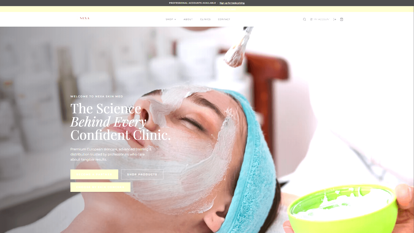
We built the NexaSkinMed website as a B2B distribution platform for a premium European skincare brand entering the UK market. The site needed to serve two distinct audiences: professional clinic accounts making regular bulk orders, and end consumers discovering the brand for the first time. The design had to communicate clinical authority, premium positioning, and the confidence of an established European brand -- all on first contact.
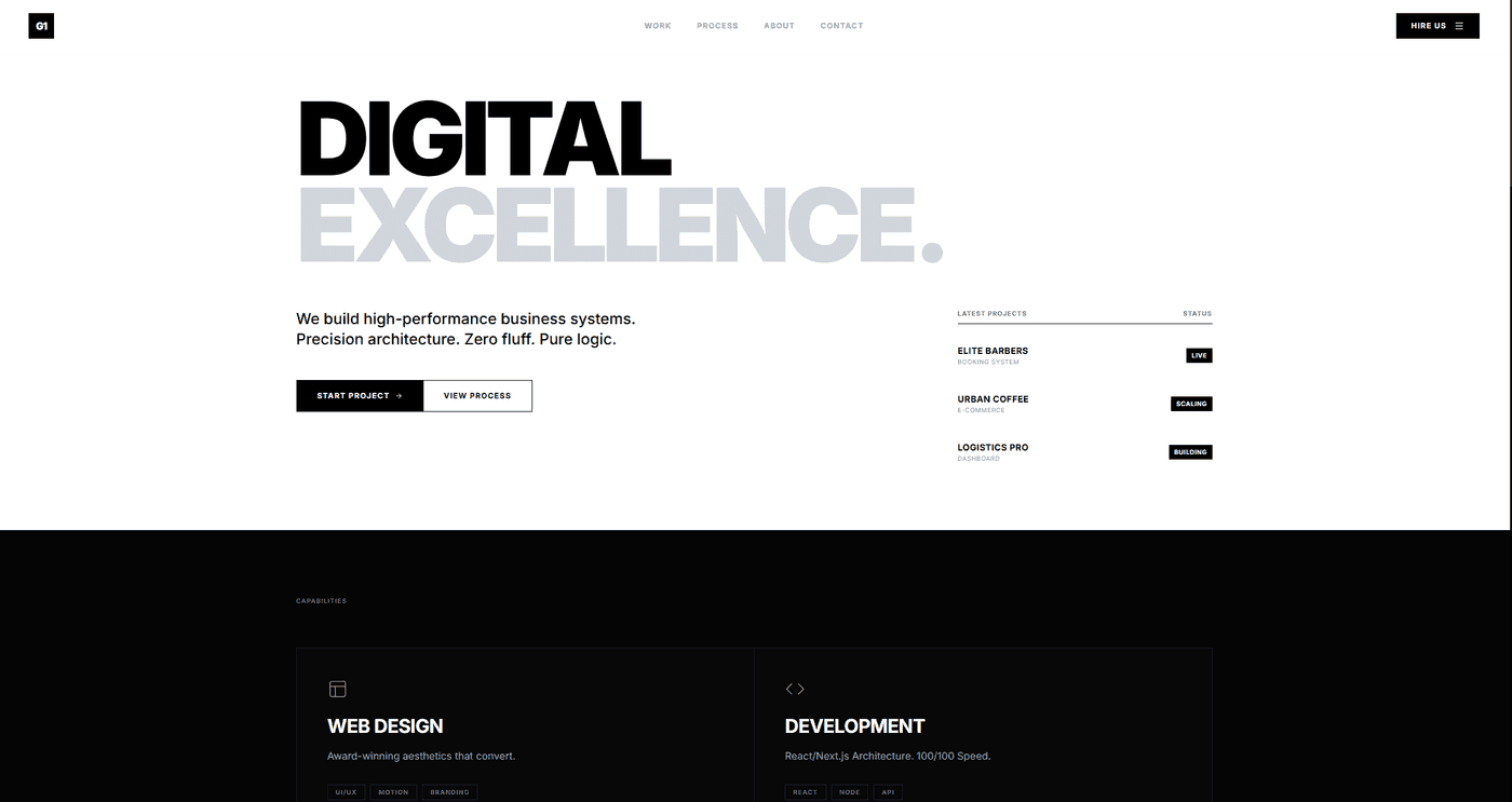
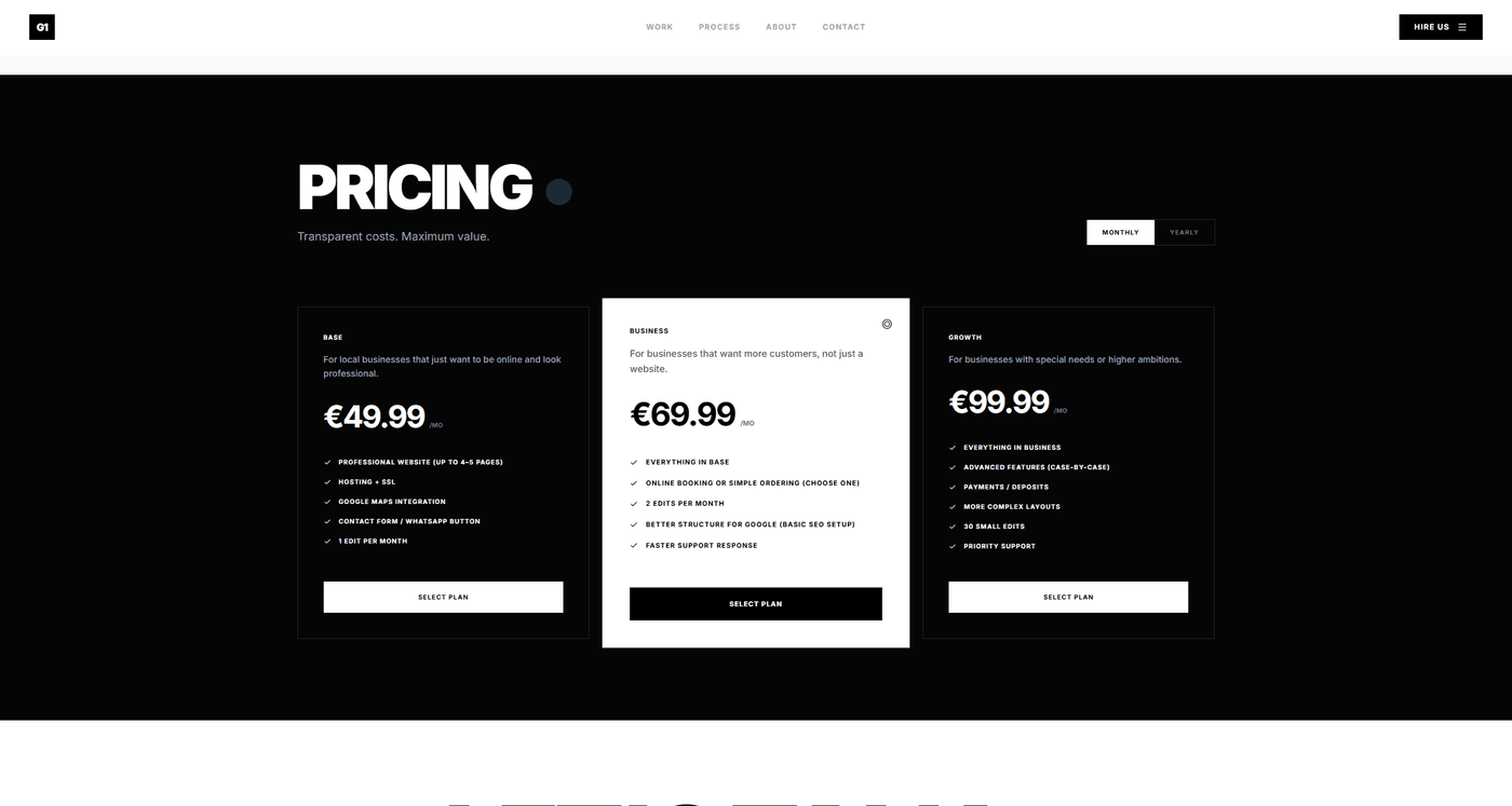
The G1 Solutions build was a different challenge -- a technology solutions business serving enterprise clients across Germany and the UK. The site needed to work in two markets, communicate technical credibility without jargon, and generate qualified inbound enquiries rather than general traffic. Clear positioning, specific service architecture, and case study integration were central to the build.
In both cases, the design decisions were driven by the specific buyer and the specific decision they were being asked to make.
Building a B2B Website That Actually Converts
A B2B website that converts requires four things that most sites are missing: clear positioning, specific proof, a buying journey that matches how enterprise buyers actually behave, and technical quality that communicates operational credibility.
None of these elements are complicated in isolation. The difficulty is building them into a coherent whole -- a site where every page, every section, and every design decision pulls in the same direction.
At TsvWeb, we build B2B websites for businesses that need their site to work as a commercial asset, not just as a digital brochure. If your website is not generating the quality of inbound your business deserves, that is a problem with a solution.
Book a discovery call and let's talk about what your site needs to do differently.