Personal Brand Website Design: What Separates Forgettable Portfolios from Standout Ones
A personal brand website is not a vanity project. It is your most controlled, most permanent presence online. Here is what the best ones get right and why most fall flat.
Your Platform Profile Is Not Enough
LinkedIn can change its algorithm. Instagram can throttle your reach. A sponsorship platform can shut down. The one channel that belongs to you completely is your website.
For executives, athletes, consultants, coaches, and content creators, a personal brand website has shifted from a nice-to-have into a genuine business asset. It is where sponsors go to check your credentials. Where journalists look for quotes. Where potential clients decide whether you are the right person for the job.
Most personal brand sites fail at this job. Not because they look bad -- many look perfectly fine -- but because they fail to communicate a clear point of view, fail to give visitors a reason to stay, and fail to convert attention into action.
Here is what the best ones do differently.
1. Your Point of View Is Clear in the First Five Seconds
The most common mistake in personal brand websites is trying to appeal to everyone. The homepage describes a person in the broadest possible terms: "Speaker. Consultant. Author. Helping professionals reach their potential." None of it lands because none of it is specific.
A standout personal brand site leads with a clear positioning statement that tells the visitor exactly who you are, what you do, and who you do it for. Not in three categories -- in one sentence.
Compare "Helping businesses grow" with "Performance coach for elite motorsport drivers preparing for international competition." The second one tells you in seven words whether this person is relevant to you or not. That specificity is not limiting. It is the entire point.
The visual design of the opening section must support this positioning. The typography choice, the photography, the colour palette -- all of it signals whether this is a serious professional operation or an afterthought.
2. The Photography Matches the Positioning
Stock photography destroys personal brand websites. A personal brand is, by definition, personal. If your hero image is a generic handshake or a blurred office background, you have immediately communicated that you are not taking this seriously.
The sites that stand out invest in professional photography that reflects the actual work. For an athlete, that means action shots from competition and behind-the-scenes training. For a consultant, it means confident environmental shots that signal authority. For a creative professional, it means imagery that demonstrates their aesthetic sensibility.
The photography should not look like it was taken at the same time as everyone else's headshots. It should look unmistakably like you.
3. The Work Section Shows Proof, Not Claims
Anyone can write "I deliver results" or "I work with leading brands." Almost nobody can back it up with specific, credible evidence presented cleanly on a website.
A standout personal brand site replaces those claims with proof. For an athlete: race results, sponsor logos, season highlights with context. For a consultant: the specific problem, the approach, the measurable outcome. For a content creator: audience numbers, campaign case studies, media mentions with dates.
The structure matters as much as the content. A wall of text describing past work is almost as ineffective as no work section at all. Clean visual presentation -- a project per row, clear outcome metrics, client logos where relevant -- lets visitors absorb the evidence quickly.
The key question to ask about every item in your work section: would a stranger who does not know me find this convincing? If the answer is no, it is probably a claim rather than proof.
4. There Is One Clear Next Step
Most personal brand websites leave visitors without a clear action to take. There is a contact page buried in the navigation. There is an email address in the footer. The visitor arrived with genuine interest and left without doing anything because the site never made a specific ask.
The best personal brand sites remove this ambiguity. One primary call to action, repeated consistently: book a call, enquire about sponsorship, download the guide, join the mailing list. That action should appear in the navigation, in the hero section, and at the end of every major page section.
The action should match your business model. If you take on consulting clients, the CTA is to book a discovery call. If you monetise through speaking engagements, the CTA is to enquire about keynotes. If your revenue comes from an audience, the CTA is to join the newsletter. One clear next step, not five half-hearted ones.
5. The Site Performs Properly on Every Device
A personal brand site is often the first impression a sponsor, client, or employer gets of you. If it loads slowly on mobile, looks broken on a tablet, or takes four seconds to show anything on a slow connection, that impression is set before a single word is read.
This is a more common problem than it sounds. Many personal brand sites are built on DIY platforms with heavy themes, unoptimised images, and page builders that generate bloated HTML. They look fine on a fast desktop connection and fall apart everywhere else.
Mobile-first design means the site is designed for the smallest screen first, then expanded -- not the other way around. Every image is compressed and served in modern formats. Load times are measured, not assumed. On a 4G connection, the site should render usable content in under two seconds.
For a personal brand where reputation is the product, a slow or broken site is a reputational signal. It suggests your attention to detail does not extend to your own presentation.
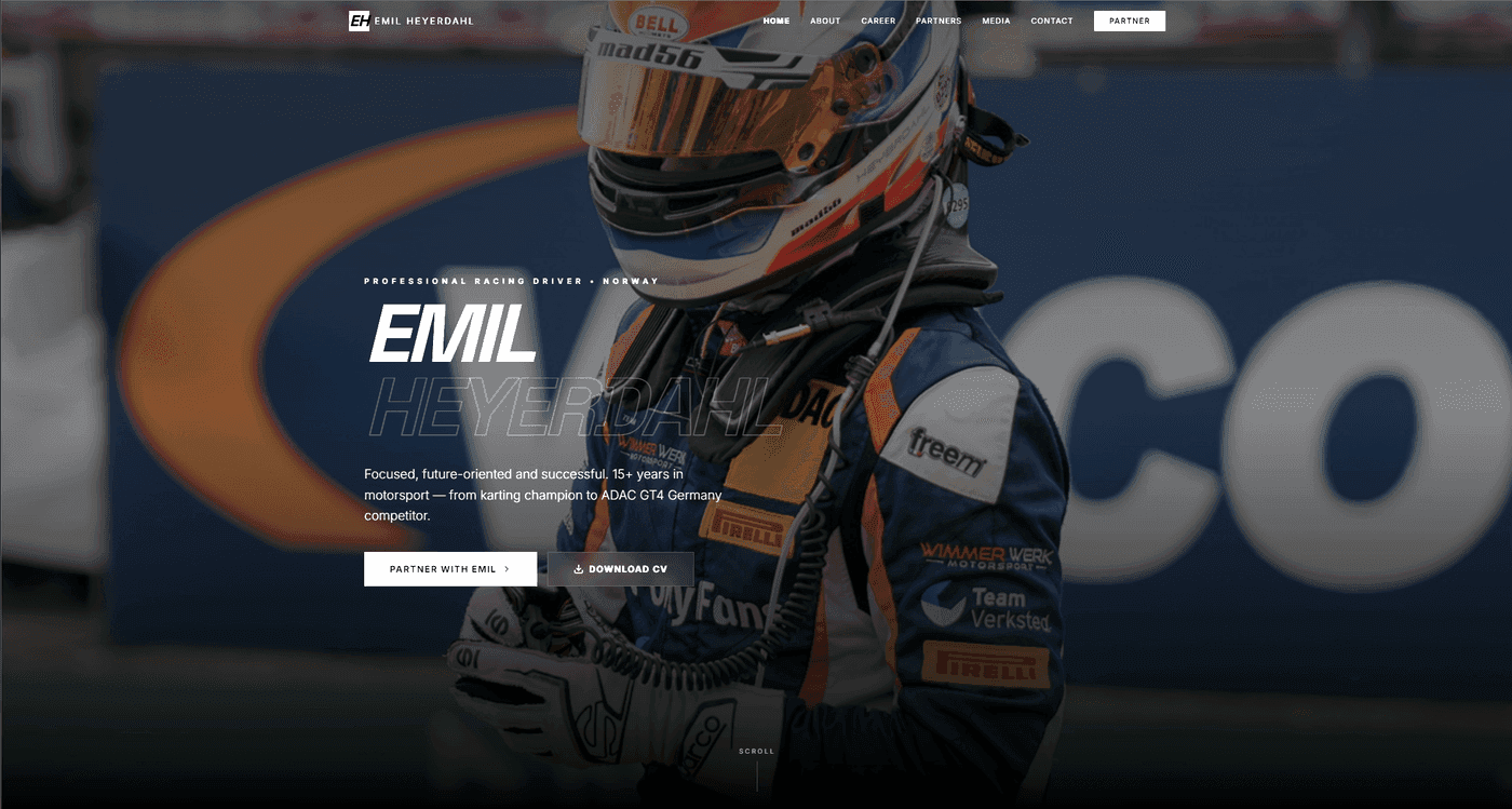
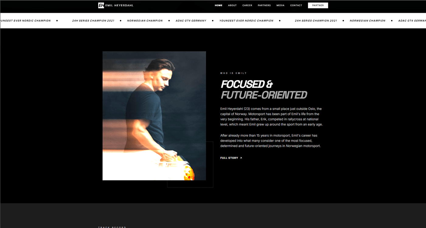
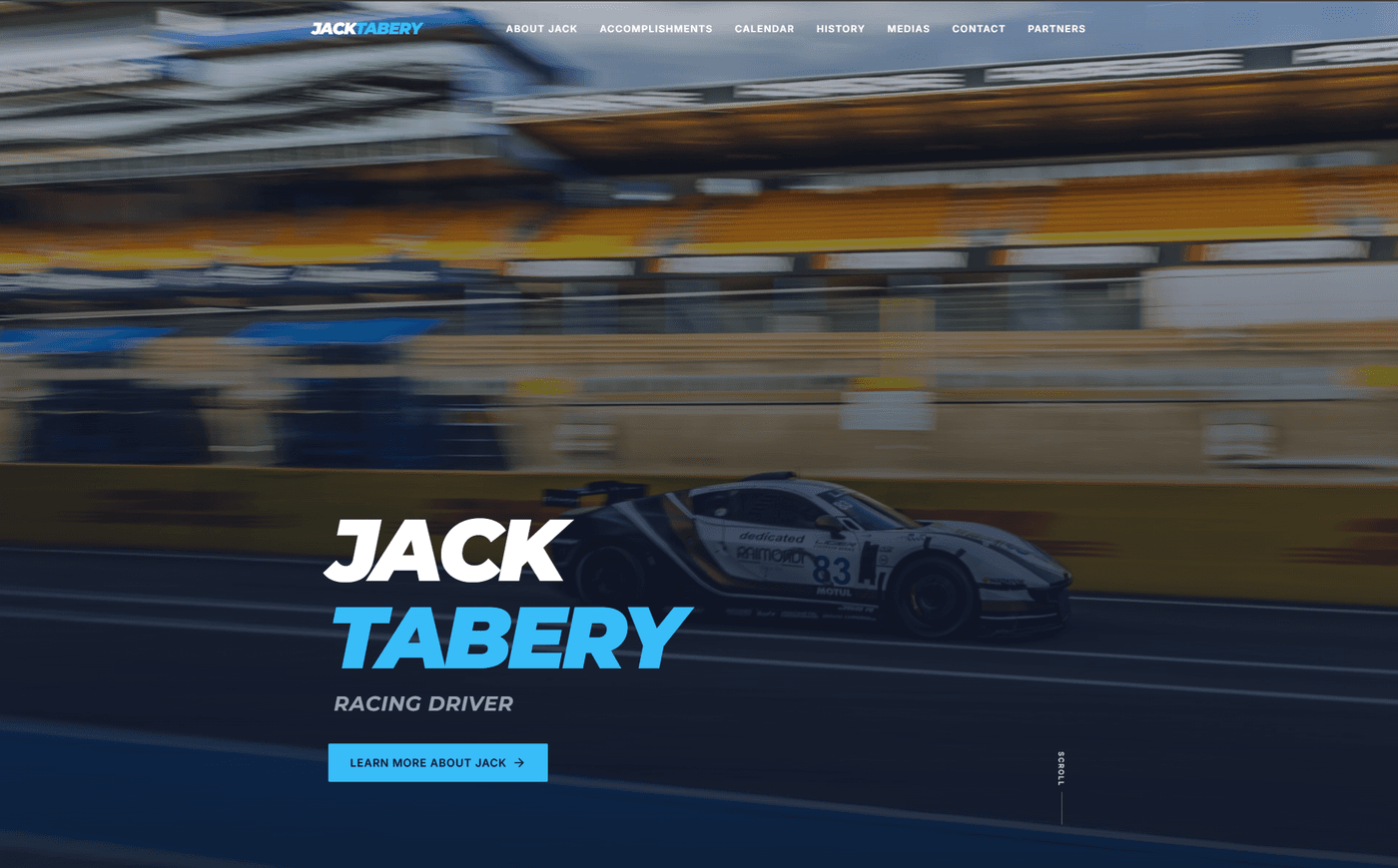
What We Built for Emil, Boris, and Jack
We have built personal brand websites for three professional motorsport drivers: Emil Heyerdahl, Boris Yonchev, and Jack Tabery. Each operates in a space where sponsors and partners form opinions based on digital presentation before any in-person conversation happens.
The brief for each was the same in structure: clear positioning that reflected their competitive level, photography that matched the ambition of the brand, a results and achievements section that gave sponsors credible proof, and a contact flow that made it easy to start a conversation.
The technical build for each was Next.js -- fast by default, mobile-first, and fully owned. No platform dependency, no monthly hosting escalation, no rebuilding required when the career progresses and the site needs to evolve.
Building Your Personal Brand Site
The brief for a personal brand site is deceptively simple: make it clear who you are, show proof of what you have done, and make it easy to take the next step. In practice, most sites fail on all three.
If you are a professional, athlete, consultant, or creator who is serious about how you are perceived online, let us talk about what your site needs to do. We will help you work out the positioning, the structure, and the level of investment that makes sense for where you are now and where you are headed.