SaaS Landing Page Design: How to Convert Visitors Without a Sales Team
SaaS landing pages have one job: convince a stranger to try your product. Here is how the best SaaS sites do it, and the design principles that drive signups without a sales call.
Your Landing Page Is Your Salesperson
Most SaaS businesses do not have a traditional sales team at launch. The founder handles demos. Maybe one person handles inbound. The marketing budget is thin.
What fills that gap is the landing page.
A well-designed SaaS landing page works around the clock to explain the product, address objections, establish credibility, and convert a stranger into a free trial signup or a booked demo. A poorly designed one sends qualified traffic straight to a competitor.
The difference between those two outcomes is not the strength of the underlying product. It is the quality of the design and the clarity of the communication.
The Five-Second Test: Do They Know What You Do?
The first rule of SaaS landing page design is ruthless clarity. Your visitor has arrived from an ad, a search result, or a referral. They are scanning, not reading. They will decide whether to stay or leave in under five seconds.
In that window, they need to understand:
- What the product does
- Who it is for
- Why it is better than the alternative they are already using
Most SaaS sites fail this test. They lead with abstract benefit language ("Grow your business faster" or "The future of work") that sounds good but communicates nothing. The visitor does not know what the product actually is.
The fix is specificity. "Book appointments online for free — built for barbers, salons, and beauty pros" tells you exactly what the product does and who it serves. There is no ambiguity. The visitor either qualifies themselves in or out immediately.
That clarity is not just good copywriting. It is the job of design to make that message land: the right typography hierarchy, the right visual emphasis, the right amount of whitespace to let the headline breathe.
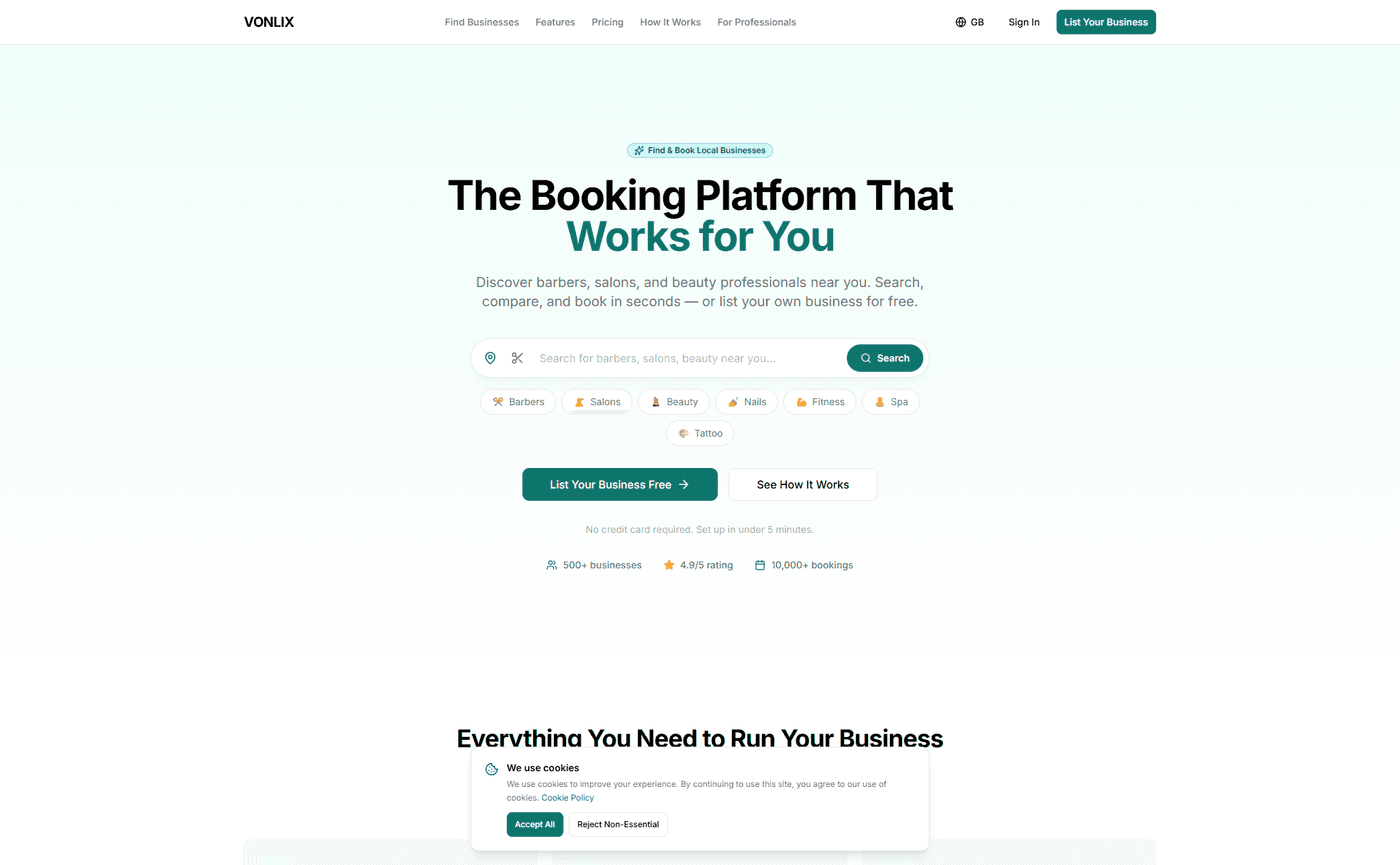
Above the Fold: Headline, Subheadline, One CTA
The above-the-fold section of a SaaS landing page needs three elements. No more, no less.
Headline: One clear, specific statement of what the product does and who it is for.
Subheadline: One sentence of supporting context — the primary benefit or the key differentiation from alternatives. Keep it under 20 words.
Call to action: One button. Not two. One. The primary conversion action — "Start for free", "Book a demo", "Get early access" — without competing options.
The visual design of this section should create immediate hierarchy. The headline should be the most prominent element on the page. The CTA button should be clearly distinguishable, with enough contrast that it is impossible to miss.
Product screenshots or a short demo video in this section dramatically lift conversion rates. Seeing the product — even briefly — answers the question "what does this look like" before the visitor has to scroll.
Social Proof: The Earlier, the Better
SaaS visitors are sceptical by default. They have seen dozens of landing pages with bold claims and no evidence. Social proof breaks through that scepticism.
The mistake most SaaS sites make is burying their social proof at the bottom of the page, in a dedicated "What Our Users Say" section that most visitors never reach.
High-converting SaaS pages place proof earlier and distribute it throughout:
- Logo bars of known clients or press mentions, immediately below the hero section — borrow credibility before the visitor has scrolled
- Specific metric testimonials placed immediately after the section that raises the relevant concern — "I was nervous about setup, but I was live in four minutes" positioned next to the onboarding section
- User counts and usage data woven into the copy — "Trusted by 3,400 businesses across the UK" is more compelling than a generic trust badge
The more specific the proof, the more effective it is. "Saved me 6 hours a week" beats "Great time-saving tool." Names, business types, and real outcomes carry far more weight than anonymous, vague praise.
Feature Versus Benefit: Show What Changes
SaaS products are complex. There is a natural temptation to list everything the product does — the full feature set, every integration, every configuration option.
Visitors do not care about features. They care about what changes in their life or business if they use the product.
The feature is: "Automated appointment reminders via SMS." The benefit is: "Cut no-shows by up to 60% without lifting a finger."
The feature is: "Built-in client CRM." The benefit is: "Know every client's history before they walk through the door."
Good SaaS landing page design leads with the benefit and uses the feature as supporting evidence. The question the page is answering at every section is not "what can this product do?" but "what does this solve for me?"
Speed as a Differentiator
SaaS visitors come from paid ads, organic search, and referral links — all of which represent traffic you have worked hard or paid to acquire. A slow landing page destroys that investment.
A one-second delay in load time reduces conversions by 7%. On mobile — where a growing share of SaaS discovery happens — 53% of visitors abandon a site that takes more than three seconds to load.
This is not a minor optimisation. It is a direct multiplier on every other conversion effort on the page.
We build SaaS landing pages on Next.js, deployed on Vercel's global edge network. Pages are pre-rendered and served from data centres close to the visitor. Images are compressed and delivered in modern formats. The result is load times that routinely hit sub-1-second on Lighthouse — fast enough that speed stops being a conversion variable at all.
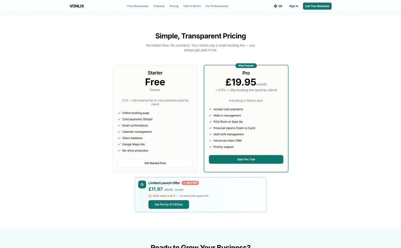
The Pricing Page: Remove Confusion, Not Price
SaaS founders often agonise over whether to show pricing publicly. The research strongly favours showing it.
Hiding your pricing creates friction. Visitors who cannot find a price either assume it is too expensive, or they leave to find a competitor who is more transparent. Displaying pricing clearly removes a common objection from the page entirely.
The design of the pricing section matters too. Three tiers is the sweet spot — more than four creates decision fatigue. Highlight the recommended plan visually. Be specific about what each tier includes. Make the upgrade path obvious without being pushy.
If you have a free trial or freemium tier, lead with it. Lower the barrier to the first conversion, then let the product do the upselling.
What We Built for Vonlix
Vonlix is a free booking platform for barbers, salons, and beauty professionals. The brief was to take a product that competes with entrenched players and present it in a way that made the choice obvious — not just for the features, but for the trust, the clarity, and the ease.
We built the landing page in Next.js with a mobile-first layout, a clear hero section that leads with the product's value proposition, social proof distributed throughout the page, and a pricing section that makes the free tier the clear entry point.
The result is a page that works as the first touchpoint for someone discovering the product — communicating what it does, who it is for, and why it is worth 5 minutes to try.
Build a SaaS Landing Page That Converts
If your landing page is driving traffic but not signups, the problem is almost always clarity, trust, or friction. We design and build high-converting SaaS landing pages that do the selling before a sales call is needed.
Talk to us about your project and let's build something that converts.