What Makes a Great Homepage in 2026
Your homepage is your most valuable page. Here's what separates a homepage that converts from one that loses visitors in under three seconds.

Your Homepage Has Three Seconds
When someone lands on your homepage, they decide almost instantly whether to stay or leave. They will not read every section, watch your intro video, or click through your navigation to figure out what you do. They will make a snap judgement and act on it.
The question is: what does that judgement tell them about your business?
A great homepage does not just look good. It works. It moves the right visitors towards an action and filters out the wrong ones cleanly.
Clarity Before Anything Else
The single most important thing your homepage must communicate is this: what do you do, who do you do it for, and why should someone care?
Most homepages fail this test. They open with a headline like "Transforming businesses for a digital world" or "Your success is our priority." These phrases say nothing. They could apply to any company in any industry.
Visitors are not patient. State your offer plainly. "We build fast, modern websites for small businesses in the UK" is not clever, but it works. In three seconds, the right person knows they are in the right place.
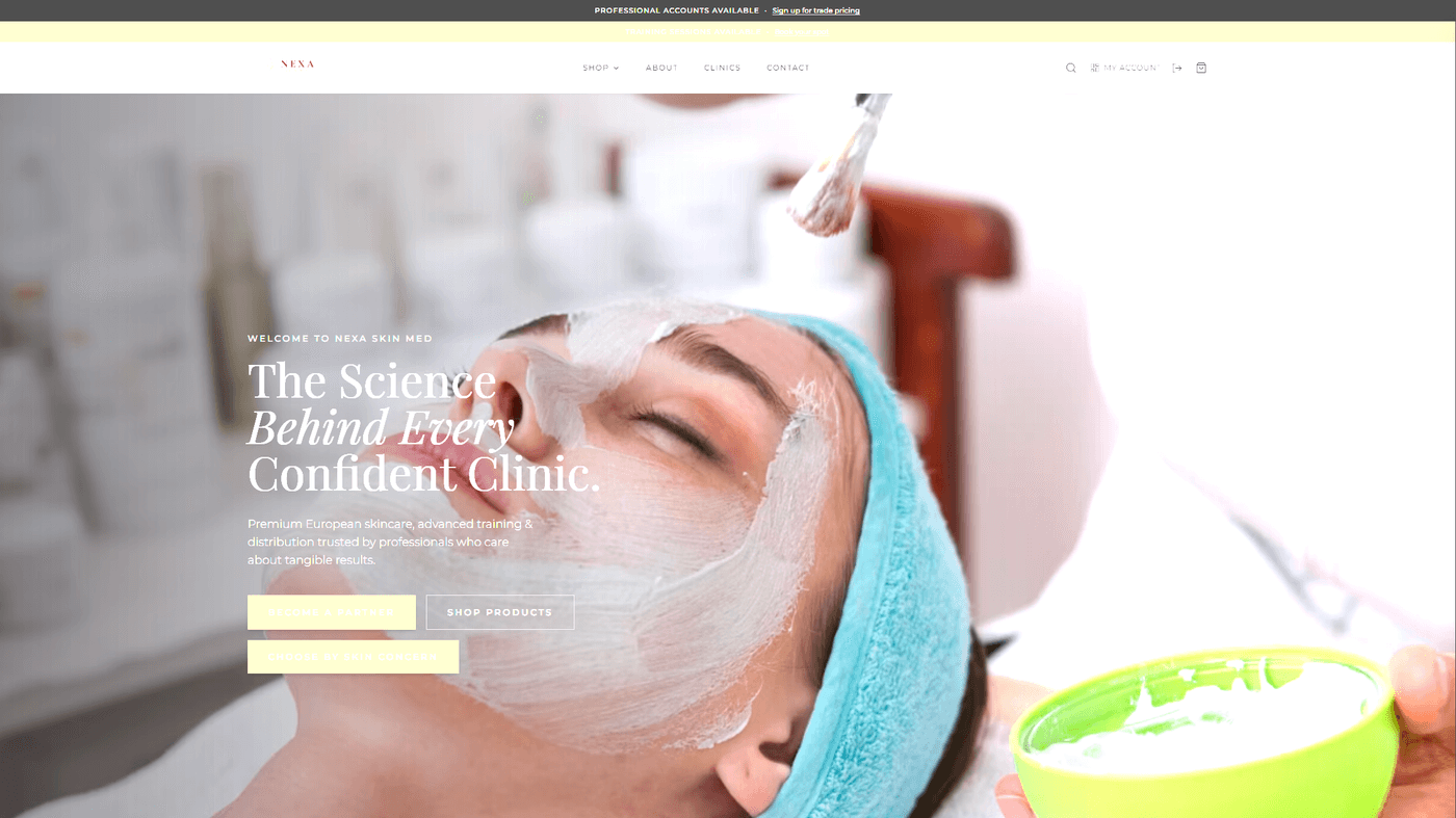
The Hero Section Does the Heavy Lifting
The area visible before any scrolling is called the above-the-fold section, or hero. It is the most valuable piece of screen real estate on your entire site.
A high-performing hero section has four elements:
- A clear headline that states what you do
- A supporting line that adds context or addresses the visitor's problem
- A single, prominent call to action
- A visual that reinforces the headline rather than competing with it
That is it. Every additional element you add dilutes the impact of those four. Resist the urge to add sliders, animations, or multiple competing buttons.
Social Proof Changes Everything
A visitor has no reason to trust you yet. They found you through Google, a referral, or an ad. Social proof closes that gap faster than any amount of well-written copy.
On the homepage, this means:
- Client logos, especially recognisable ones
- Testimonials with real names and photos
- Specific results ("Increased enquiries by 40%" beats "We improved their business")
- A short case study or portfolio preview
One strong testimonial placed near your main call to action is worth more than a full "What We Do" section. People trust other people more than they trust brands.
Every Section Needs to Earn Its Place
Scroll down almost any business website and you will find sections that exist because someone thought they should. The "Our Values" block. The generic "About Us" paragraph. The three-column icon grid explaining the process.
Each section on your homepage should answer one question: does this move a visitor closer to taking action, or does it add friction?
If a section does not do a specific job, remove it. A shorter homepage that is clear and direct will outperform a longer one that tries to cover everything.
Speed and Mobile Are Not Optional
In 2026, most visitors arrive on a mobile device. If your homepage takes more than three seconds to load on a phone, you have already lost a significant share of your audience before they read a single word.
This is not a design problem. It is a technical one. Image formats, hosting quality, and how JavaScript loads all determine whether a visitor sees your homepage or a blank screen. A well-built Next.js site loads in under a second on mobile. Most website builder sites do not come close.
The Homepage Checklist for 2026
Before your homepage goes live, it should pass this test:
- Does the headline explain what you do in plain language?
- Is there one clear call to action above the fold?
- Does the page load in under 2 seconds on mobile?
- Is there social proof within the first two scrolls?
- Does every section have a clear purpose?
- Is the navigation simple and uncluttered?
- Are images compressed and served in a modern format like WebP?
If any of these fail, you have a clear opportunity. Fix the weakest points first, measure the impact, then move on.
What We Get Right at TsvWeb
At TsvWeb, every homepage we build is structured around one goal: turning the right visitors into enquiries or sales.
That means a clear hierarchy from the first line of copy, a hero section with a single focused CTA, social proof positioned where it does the most work, and a technical foundation that loads fast on every device. Nothing is added because it looks nice. Everything is there because it earns its place.
If your current homepage is not doing its job, talk to us about a rebuild.